There may be a lot of change-ups on this season's New York Fashion Week calendar, but we can always reliably crib some new trends that will be everywhere six months later (if not sooner). And thanks to the colour-predicting wizards at Pantone, we also have some foresight into the hues we'll be wearing constantly in the near future.
The Pantone Colour Institute's biannual fashion report, released each season on the first day of NYFW, highlights the shades that are bound to dominate the collections. Fall 2016's top 10 are heavy on the blues as well as reddish-brown shades. Also, there are six colours that are brand-new to the Pantone universe. You definitely won't have to overhaul your closet: Spring '16's dominant colour story (softer hues intended to bring calm in an increasingly busy landscape) and Pantone's Colours of the Year are still relevant for fall '16.
“If you look at this season’s entire palette, the idea of comforting blues coming to the top of the list again shows that people are still searching for that reassurance,” Leatrice Eiseman, executive director of the Pantone Colour Institute, said in a press release.
These uplifting blues (a deep one called Riverside, as well as the lighter, aptly titled Airy Blue) appear alongside dependable, but unexpected, neutrals, like Sharkskin grey and Spicy Mustard yellow; all of those shades pop against the rest of the top 10, like warmer Aurora Red and pinkish-purply Bodacious. The report's big themes, according to Eiseman, are stability and confidence, as seen in reliable colours in bold shades.
The similarities between the spring and fall reports don't end there. There are a lot of nature references, like in seasons past; this time around, the earthy vibes come courtesy of vibrant earth tones like Dusty Cedar and Lush Meadow. Pantone notes that designers are once again drawing from fine art for inspiration — specifically seen in the contrast between the fluidity of abstract patterns and the clean decisiveness of graphic lines. And like spring '16's selection of shades, the palette featured in this season's report is gender-neutral.
The Pantone Colour Institute surveyed 21 designers about their colour choices for fall '16. Ahead, preview these designers' sketches, which incorporate the season's top shades (or similar hues), before the looks hit the catwalk. Plus: Find out which shades they never thought would end up in their designs.

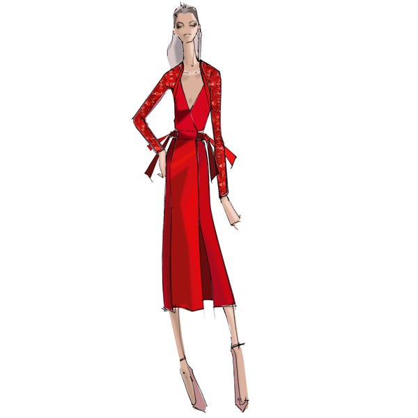
A pop of red is a perennial hit, season after season; Fiesta was spring's in-demand rouge. For fall, it's all about Aurora Red (18-1550), which we'll be seeing on Christian Siriano and Bibhu Mohapatra's runways.
Photo: Courtesy of Pantone.
What colours will be most prominent in your Fall 2016 collection?
"The collection will have a mix of vibrant Red, which is classic, powerful, and elegant, paired with soft heather greys and a citrus chartreuse. As the collection progresses [on the runway], so does the colour. The colours are bold, vibrant, and powerful."
Which hue are you now attracted to that you wouldn't have used in the past?
"I love green, but it's sometimes a hard color to work with. I hope to explore it more in the next few seasons!"
Photo: Courtesy of Pantone.
What's the most important colour in your fall '16 collection?
"Empress Red; I was inspired by a recent trip to The Forbidden Palace in Beijing, China."
Which hue are you now attracted to that you wouldn't have used in the past?
"Dragonfly Teal, because it compliments the heightened colours in this season's collection."
Photo: Courtesy of Pantone.
Warm Taupe (16-1318) emerges as the stand-out neutral for fall '16. You'll spot it in Iris Von Arnim's latest collection, paired with rich browns and other creamy shades. Outside of the neutral family, though, Pantone highlights its ability to complement all the other colours in this season's report.
Photo: Courtesy of Pantone.
What's the most important color in your fall '16 collection?
"Espresso Brown, which has a greyish, not reddish, shade. It works well with our other key colours, Nude, Amethyst, and Cognac. For silks, furs, knits, and leather, we chose lighter and darker versions of this Espresso tone. For the knits, we specially washed the yarn, adding an optic depth to the colour."
Which hue are you now attracted to that you wouldn't have used in the past?
"We utilised Cameo Pink, which is an unusual colour for us. Once we saw it in combination with Deep Lichen Green as a contrast colour, we realised [Cameo Pink's] flamingo hue gains a unique beauty."
Photo: Courtesy of Pantone.
Lush Meadow (18-5845) recalls the great outdoors — specifically, the rich foliage that gets lost so quickly once the temperatures start to dip. (Luckily, our wardrobe can remind us of warmer times.)
Photo: Courtesy of Pantone.
What's the must-have item for fall 2016?
"There's a lot of sex appeal for fall — sheer illusions, high slits, and ornate bead work — to emulate the artistry and appeal of body art. Some must-have items of the season include a sexy Pirate Black lace and velvet gown with cut outs and a Hunter Green and Bran embellished shift dress with an oversized Hunter Green and Pirate Black faux fur jacket."
Which hue are you now attracted to that you wouldn't have used in the past?
"While it's inevitable to avoid black, I tend to gravitate towards warmer tones that make me happy. This season, though, I fully embrace black; it adds a level of boldness and sexiness to the collection."
Photo: Courtesy of Pantone.
It may be the year of Rose Quartz, but Dusty Cedar (18-1630) makes the case for a more muted pink for fall '16. Spot it among the colourful prints at Rachel Pally.
Photo: Courtesy of Pantone.
What's the most important colour in your fall 2016 collection?
"This season, our colours are so complementary and work beautifully together as a group. That said, Inca Gold is a show-stopper, yet it's also so wearable because of how muted it is. This colour makes our foliage print pop and brings vibrancy to the whole collection."
Which hue are you now attracted to that you wouldn't have used in the past?
"Purple! We used to say it was our least favourite colour, but we’ve been using variations of Violet and Plum for the last few seasons; we’re loving it and the way other colours play off of it."
Photo: Courtesy of Pantone.
In line with the search for calm that symbolically rules this season's palette, the name of this shade — Potter's Clay (18-1340) — channels the laborious process of creating something by hand. The hue belongs to a more traditional fall colour scheme, mingling brilliantly with other shades of brown and orange.
Photo: Courtesy of Pantone.
Katherine Kung of Kung Katherine
What inspired your choice of colours?
"My recent trip to Tokyo and Kyoto was the inspiration for this collection as well as the basis for the colour story. The reflection on the pond of Kinkaku-ji (Temple of the Golden Pavilion) surrounded by deep green Japanese pine trees is probably one of the most beautiful sites I have ever visited. The image really stayed with me; I guess I must have subconsciously pulled from that memory when designing."
Which hue are you now attracted to that you wouldn't have used in the past?
"Mustard Orange is a very rich yet particular colour. It can be tricky to work with, but when you pair it with the right outfit or accessory, it's an absolute show-stopper."
Photo: Courtesy of Pantone.
Pantone thinks that Bodacious (17-3240), a deeper alternative to 2014's Colour of the Year, Radiant Orchid, is a testament to the increasingly gender-neutral colour palettes we've seen on the runways in recent seasons.
Photo: Courtesy of Pantone.
What inspired your choice of colors?
"My fall' 16 collection is based on a mathematical function, so I've used Black and white as the base colours of the collection. Staying true to the brand's DNA, I built on this and included the colours Bone, Pale Orchid, Slate, Peacock, Sage, Cement, Teal and Chrome."
Which hue are you now attracted to that you wouldn't have used in the past?
"Right now, I'm attracted to anything in the Orchid family, in particular the pale shades. I always felt these colours looked old and dusty, but all of a sudden, they've started to look good to me."
Photo: Courtesy of Pantone.
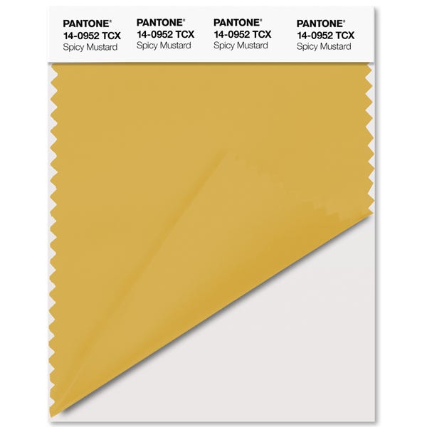
Spicy Mustard (14-0952) confirms our beliefs that a darker yellow hue has a place in our go-to fall colour palette, alongside shades of burgundy and navy. The citrus-y shade will pop up a lot as an accent, both in prints and embellishment, in the upcoming collections, according to Pantone.
Photo: Courtesy of Pantone.
Charles Borg and Ron van Maarschalkerweerd of Charles & Ron
What colours will be most prominent in your fall '16 collection?
"Cardinal Pink, Warm Red, and Saffron Yellow, which are featured in a graphic colour-block and stripe pattern. These colours are mixed with Rich Classic Camel and highlighted with Black."
Which hue are you now attracted to that you wouldn't have used in the past?
"Rich Classic Camel is a new colour for us; we were attracted to this colour because it's the perfect neutral. It created the right colour balance together with the more vibrant shades in the collection."
Photo: Courtesy of Pantone.
Could this finally mean the dawn of the groutfit? Sharkskin (17-3914) acts as a neutral on Pantone's fall '16 report, easily matching up with both bright and soft shades (and looking just as lovely when worn head-to-toe) in a modern and unexpected fashion.
Photo: Courtesy of Pantone.
What colours will be most prominent in your fall '16 collection?
"Different shades of grey are most prominent, as well as accents of Burgundy and Violet."
Which hue are you now attracted to that you wouldn't have used in the past?
"Violet: I'm using it because it looks beautiful and compliments grey."
Photo: Courtesy of Pantone.
Christopher & Nicholas Kunz of Nicholas K
What colours will be most prominent in your fall '16 collection?
"Aubergine, Amethyst, Mauve, Chestnut, Mocha, Cocoa, Carbon, Black, Beige."
Which hue are you now attracted to that you wouldn't have used in the past?
"Aubergine, because it complements various skin tones and looks great with neutrals."
Photo: Courtesy of Pantone.
Peter Trainor and Anne Marie Maniego of Max ‘n Chester
What colours will be most prominent in your fall '16 collection?
"Warm and cool greys, Charcoal, and Navy."
What inspired your choice of colours?
"We always like to work with neutral tones and fibres."
Photo: Courtesy of Pantone.
Bree Telford of QUINN
What colours will be most prominent in your fall '16 collection?
"Tone-on-tone mixing and the addition of an accent colour to neutrals play heavily into the collection, like Coconut Milk mixed with Pure Cashmere in textural geometric jacquards, or shades of Ivory and Coconut Milk for tone-on-tone play.
Which hue are you now attracted to that you wouldn't have used in the past?
"Sepia Rose: It's subtle, versatile, delicately feminine, and works as a solid colour or mixed within patterns and textures."
Photo: Courtesy of Pantone.
"The colour Blue is fundamentally important to the human eye as a stable icon of the balance in our universe," Eiseman explained in the press release. Riverside (17-4028) is the darker shade of blue featured in Pantone's fall '16 colour report — and also one of the most predominant. It'll take shape as casual outerwear at Rebecca Minkoff and as elegant embellishment at Lela Rose, tying together a range of aesthetics and warm colour combinations.
Photo: Courtesy of Pantone.
What inspired your choice of colours?
"The colour inspiration came from my idea of the global traveller. Who that girl is and what she sees while on an adventure is reflected through her clothes."
What's the most important colour in your fall '16 collection?
"An important colour focus for our fall 2016 collection was the tonal mix of warm Reds: Rumba Red and Barbados Cherry, juxtaposed with contrasting cool hues, like Surf the Web."
Photo: Courtesy of Pantone.
What inspired your choice of colours?
"Jonas Wood served as an early inspiration for the collection, especially with his use of geometrics and botanics. There's an exploration of leaves and the graphic geometry inherent in their patterns. Leaf shapes and patterns can be seen in prints, embroideries, jewellery details, and even shapes in the collection."
Which hue are you now attracted to that you wouldn't have used in the past?
"The vibrant hue of Oxblood: It’s not only beautiful, but extremely wearable. It compliments other tones in the collection. I love incorporating it into different silhouettes, whether it be a botanical fil coupé dress or a placed-lace sheath."
Photo: Courtesy of Pantone.
Don O'Neill of Theia
What's the most important colour in your fall '16 collection?
"Rio Red is the most important colour this season. This rich red, soaked in blue and brown undertones, is divine in saturated crepes or richly embroidered evening gowns. The colour is sublime when paired with the darkest Midnight and, with lamé metallic yarns added, [creates a] gorgeous marriage of colours."
Which hue are you now attracted to that you wouldn't have used in the past?
"Oxblood is the colour that I would not have used in the past. It has always been a difficult colour at retail. However, this season it feels so right."
Photo: Courtesy of Pantone.
Angela Taylor George of Alice & Trixie
What colours will be most prominent in your Fall 2016 collection?
"The gemstone is our muse for fall '16, so there's Intense Lapis, Bold Emerald, Sparkling Sapphire, and Clear Aquamarine, with accents of Peridot. Hints of Russian Ruby and Amethyst also join the party."
Which hue are you now attracted to that you wouldn't have used in the past?
"Dark Chocolate Brown is on my mind recently. This luxe colour used as an accent done the right way can elevate the palette. I particularly see this colour in suede."
Photo: Courtesy of Pantone.
What inspired your choice of colours?
"I was inspired by the musical recordings of the Blue Note Jazz record label and photographs by Francis Wolff along with Reid Miles' graphic design."
What's the must-have item in your fall '16 collection?
"It's the merino wool turtleneck, which should be worn under a suit. We're offering it in Blue Note, Oxblood, and Stone Grey."
Photo: Courtesy of Pantone.
Marcia Patmos of M. Patmos
What inspired your choice of colours?
"I was inspired by Japanese 'boro' quilting, vintage European army blankets, and army surplus sweaters, British 'schoolboy' scarves, a photo from 1959 of Jean Seberg in Aran knit sweater, and paintings by Robert Motherwell."
Which hue are you now attracted to that you wouldn't have used in the past?
"Biking Red: it looks so great in vintage schoolboy scarves mixed with classic neutrals like Navy and Grey Heather."
Photo: Courtesy of Pantone.
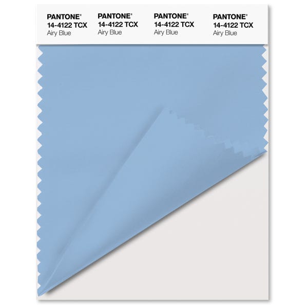
On top of Riverside, there's also a lighter shade called Airy Blue (14-4122), which is closer to (and builds on) the soft vibes of Serenity, Pantone's other Colour of the Year. The report indicates that many designers incorporate both Riverside and Airy Blue into their collections.
Photo: Courtesy of Pantone.
What is the most important colour in your collection for Fall 2016 and why?
"I love Cobalt Blue for winter, because it has a richness to it. It also gives prints a boldness, which I find important."
Which hue are you now attracted to that you wouldn't have used in the past?
"Ice Blue, because although I have never been big on winter whites or pastels in fall or at any time of the year. I do like how the Ice Blue gives a very wintery feel to the collection. I prefer it in conjunction with dark colours, rather than on its own."
Photo: Courtesy of Pantone.
What inspired your choice of colours?
"Haunting botanicals as found in Japanese prints. I have been looking a lot at the work of Keika Hyakugiku. His prints of chrysanthemums are both frightening and divine. His evocative illustrations of flowers seem to embody the modern spirit; they are in constant flux and motion, the colours are rich and spare, and the lines are delicate but direct. There is something very commanding in these prints that I found both inspiring and relatable."
Which hue are you now attracted to that you wouldn't have used in the past?
"Little Boy Blue: in the past, as the name says, I would have thought it is a men’s or boy shirt colour. Well, the sky is the limit with women’s rights."
Photo: Courtesy of Pantone.
Shaikha Noor Al Khalifa and Shaikha Haya Al Khalifa of Noon by Noor
What's the most important colour in your fall '16 collection?
"Trooper, which is statement colour that has a very subtle feel."
Which hue are you now attracted to that you wouldn't have used in the past?
"We make sure to use colours that we are always attracted to, so in this collection, there aren’t any that we have changed our minds about!"
Photo: Courtesy of Pantone.Like what you see? How about some more R29 goodness, right here?
The Accessories Trend You're About To See Everywhere: Resin Earrings
The Fashion World Applauds Clare Waight Keller's First Couture Collection At Givenchy