It’s no surprise that soft pastel shades have moved from nursery territory to grown-up spaces at home lately. Pretty and delicate, soft ice cream tones inject colour into a space without overpowering it, leaving rooms feeling calm, light and serene. A quick scroll through Pinterest or Instagram will confirm that this candy-sweet spectrum has made its mark in interior design all right, but there are certain pitfalls with this palette too. To avoid a space that looks like the inside of a Polly Pocket, it’s essential to team pastels with clean lines, minimalist shapes and geometric graphics. Materials must be considered too: concrete, marble, metallics and timber will side step a saccharine look, whereas anything too frilly, lacey or fussy will result in your home looking like a frump. And then there’s the golden rule, which in fact, pretty much applies to every situation in life: NO BUNTING. Or your room really will end up looking like a never-ending baby shower. Click through for eight ways to get it right.

A graphic wall treatment is a refreshing way to use pretty pastels without the danger of looking twee. The bolder, the better, too, as pale shades will soften down your design anyway – so be as eye catching and ambitious with your design as you dare. Intersecting geometric shapes or two-tone walls look crisp and directional – two words you might not have associated with lilac and peach before…
Courtesy of Decoist
We’re all familiar with the concept of a cluster frame wall by now – and maybe even a little bit (dare we say it) fatigued by them? But this version has somehow reinvigorated our appreciation for the look anew with its colour palette focused edit. Dip a toe into the world of pastels by curating imagery in sugary tones, even customising a few frames to match. Top off with a sprinkling of similarly hued accessories and you’ve got a veritable confection of a corner.
Courtesy of Style by Emily Henderson
Nobody could accuse this space of playing it safe; a bold aqua and white striped ceiling and a contrasting bubble gum pink wall screams confidence and cutting edge cool. Team with sleek dark timber furniture, metallic accessories and concrete surfaces to avoid looking like a pick ‘n’ mix bag. Sweet.
Courtesy of Alcro
The ombre look shows no signs of going anywhere fast, whether it’s concerning your hair, your jeans or your walls. Because pastel shades are all pretty similar in tone, they make a great palette for colour fades, and can blend into one another easily. A foolproof way to achieve this effect is to paint wide sections of a wall in a spectrum of different shades, or gradually fade one colour by using consecutively lighter tones of the same shade. Fade away and radiate…
Courtesy of Dulux
Pastels aren’t just for living spaces; they can work their magic in bathrooms too. In fact, using pretty shades in a highly functional zone such as a shower room looks all the more cool. A delicate mint green tile with an irregular finish like this will add interest and keep a minimal wet room from feeling like a utilitarian school changing room shower – because nobody needs to be reminded of the pain of year nine P.E.
Courtesy of Retrouvius
Flooring can be a game-changing surface for a space, and with so many interesting materials and colours around right now, there’s no excuse for heading straight for the laminate flooring isle anymore. This powder-blue flooring is a case in point – it sets a playful tone for a small space and establishes a colour palette, so it only takes the smallest of pastel accents and accessories to give the space some flavour.
Courtesy of Kim Gray
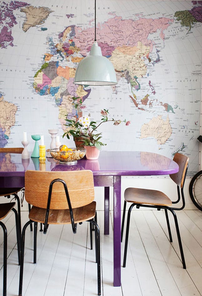
Opting for a pastel colour palette needn’t mean you can’t mix brighter accent colours in the same room. Take this dining area for instance; the graphic wallpaper mural of a world map in a pastel-heavy palette provides a complementary backdrop for furniture and bits and bobs in brighter variations of the same shades. World class.
Courtesy of Brit
Adding a dark element to a pastel colour palette is perhaps the sexiest way to work pastels. Just look to your lingerie for further evidence if you don’t believe us; pale pink and navy, nude and black, peach and grey – the list goes on. Just a smidge of the dark and moody will transform your pretty space into a den of sophistication in an instant.
Courtesy of Julie AnsiauLike what you see? How about some more R29 goodness, right here?
My Studio Flat Costs £1,325 A Month — Here's What It Looks Like