It’s official, we are a nation of neutral lovers. From our walls to our wardrobes, our lives are in danger of becoming pretty much one continuous monotone – mostly consisting of that tasteful, middle class type of grey. While we’re not saying our love affair with grey is over quite yet, there comes a time when you look around and think – when did we all become so safe (or should that be vanilla)? Perhaps our obsession with all things minimal and Scandi is to blame, but surely there’s more to decorating than Downpipe and Elephant’s Breath. Thankfully, there is a wave of colour mavericks afoot, boldly going where no Farrow & Ball catalogue dares, clashing colours with joy and abandon. Clearly, it pays to be daring, because like peanut butter and jam, and chocolate and pretzels, these unexpected combinations shouldn’t work, they just do.

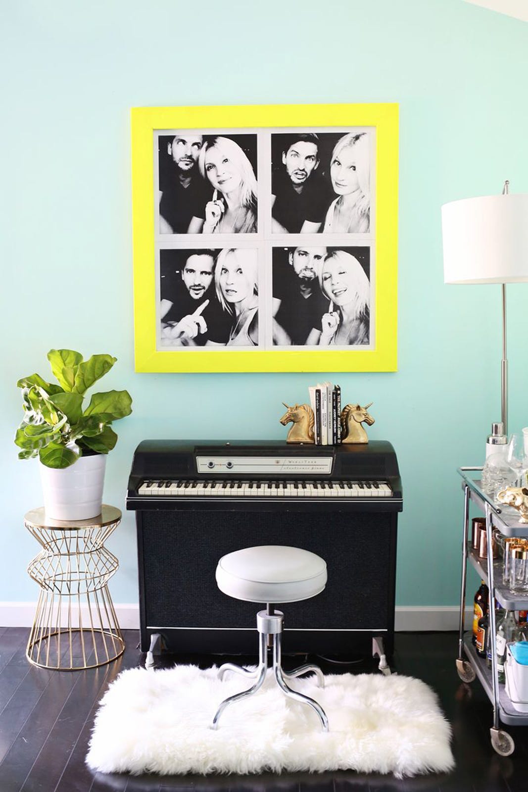
Aqua and Citron
Only a small amount of this zesty shade of yellow is needed, so use with caution. A painted picture frame or two is just enough to make an aqua wall come alive and provides an effective focal point to a space that lacks a centre. Pop Art just took on a whole new meaning.
Photo: http://www.abeautifulmess.com/2014/11/try-this-oversized-photo-booth-prints-for-under-10.html
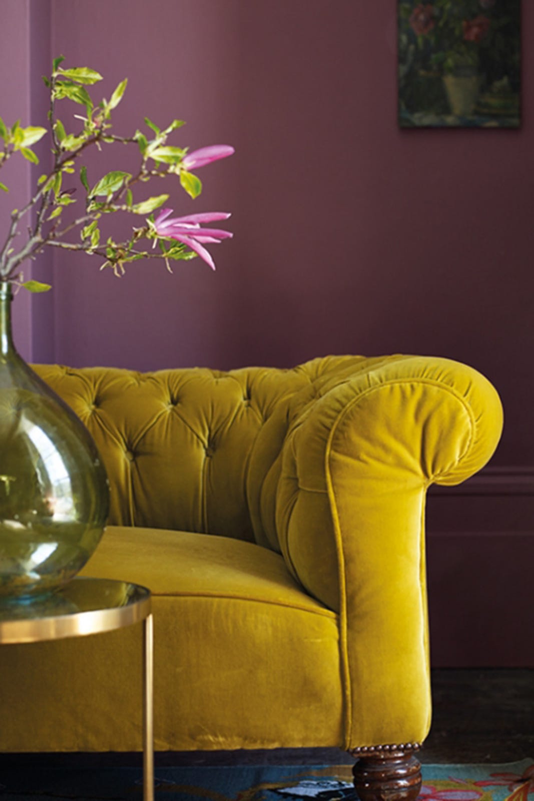
Plum and Mustard
No, we’re not talking Cluedo suspects, but two very British hues working in unison to create a rich and opulent setting. Colour needn’t have to be the domain of walls either – this mustard velvet sofa proves its point against Fired Earth’s Tyrian Rose and the two together create a welcoming space with a sense of theatre.
Photo: Fired Earth’s Tyrian Rose matt emulsion which costs £38 for 2.5 litres (www.firedearth.com / 0845 366 0400)
Blush and Garnet
Two different shades on the same side of the spectrum will clash in a good way if you know how to handle them. Stylist Emily Henderson keeps it largely neutral in this scheme, offering a hit of colour with the deep red tablecloth and blush pink curtain. Glam gold chairs, loads of textures and shaggy sheepskins add a bohemian ‘I just threw this together!’ look.
Photographed by Tessa Neustadt for http://stylebyemilyhenderson.com/blog/chic-and-affordable-winter-rustic-tablescape
Khaki, Pine Green and Viridian
How the stylists responsible for this unusual scheme discovered that blue, green and khaki looked pretty damn chic together, we’ll probably never know, but we’re glad they did. Not just an inspired trio, but an inspired setting too, it makes you seriously rethink your attitude towards dark colours in the bedroom. These shades are Aged Bronze, Viridian Tide and Alpine View, all by Dulux. Step away from the white paint…
Photo: Dulux
Orange, Periwinkle, Plum and Grey
Using orange without accidentally creating a room that looks like a set from a 1970s sitcom is a tricky task, but this striking colour palette proves that actually, it is possible. A crisp paint effect also helps – think stripes, chevrons and blocking – anything but paisley and florals basically. Try Lola Plumb, Opening Season, Steel Drum, Cloud Burst and Hot Toddy – all Crown Paints.
Photo: https://www.crownpaint.co.uk
Copper, Pale Blue and Grey
A colour that could easily be mistaken for bare plaster seems an odd choice for room inspo, but the warm and flattering tones of copper work surprisingly well with cooler shades such as pale blue and grey. Dulux’s Copper Blush interprets the metallic in matt paint form, creating a soft and cosy mood while avoiding chintz, pink or anything else uber girly. So cosy in fact, that leaving your bed each morning might become even harder.
Photo: https://www.dulux.co.uk/en/colour-inspiration
Brown, Black and Cobalt
We never thought we’d be lusting after a brown interior, but that day has (sort of) arrived thanks to Little Greene’s colour expertise. Now brown’s not the easiest shade to pull off without looking like a 1970s horror, but we can’t help but love this Mondrian-inspired graphic mural which uses a sparing amount of the brand’s Tan and Mocha shades. A touch of cobalt (Deep Space Blue in this case) brings the space up to the 21st century.
Photo: http://www.littlegreene.com/inspiration?material=23Like what you see? How about some more R29 goodness, right here?
Can The Way You Decorate Your Room Improve Your Sleep?
Ikea Just Dropped A Collection Designed By Beyoncé's Stylist